No offense do anybody but I don't like either of them. I still prefer EA's original wallpaper. ViperGT's is too busy and crowded. A wallpaper must be suttle but still have a point. I don't like the upside down BMW and reversed writing. Dragon-of-Rune"s too dark and it is too small. There is too much black space. The winner? EA's original wallpaper.
If you can do "much better then don't just tell us show us! and furthermore I don't even have photoshop i have microsoft picture it 7.0 not to mention there are no "art classes" that use photoshop to do anything. SO IF YOU CAN DO BETTER SHOW US
@2furio now you sound real stupid. First you said that our wallpapers suck because it's easy to make with a few filters (i only used the brush tool nothing more) and stereo just did the same use a few filters and your done. But let us see your oh so great wallpaper that you need a few days to make. Oh my wallpaper was made in 5 minutes. And another thing EA doesn't have a most wanted wallpaper yet it's just a promopicture.
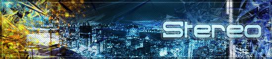
@Stereo No offence your wallpaper is nice i just want to point at something 2furio said.
Dragon-of-Rune wrote:@2furio now you sound real stupid. First you said that our wallpapers suck because it's easy to make with a few filters (i only used the brush tool nothing more) and stereo just did the same use a few filters and your done. But let us see your oh so great wallpaper that you need a few days to make. Oh my wallpaper was made in 5 minutes. And another thing EA doesn't have a most wanted wallpaper yet it's just a promopictur.


