Page 2 of 3
Posted: 24 Jan 2007, 00:30
by korge
Bleh...
Image Removed
Posted: 24 Jan 2007, 03:12
by Jopuma
Here's mine. It's crap, but I didn't have time to really care about making a higher quality signature.
Final Entry

Posted: 24 Jan 2007, 05:20
by S2000_Skyline12
Here's my final entry decided to change my game
Final Entry

Posted: 24 Jan 2007, 08:01
by boganbusman
Jopuma wrote:The Gravedigger wrote:SRDragoon20 wrote:heres mine ^^
You are 14.9kB over the size limit grasshopper!
Begun your training has, use the compression Luke.
No, teach him wrong you will. Learn to use the Save for Web feature you shall.
What the hell do you think 'Save for Web' is?? A tea party?
It lets you optimise the image by
compressing it

Posted: 24 Jan 2007, 15:43
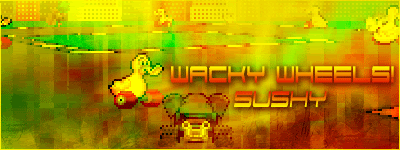
by sushy
FINAL ENTRY
...
Posted: 24 Jan 2007, 16:47
by Jopuma
boganbusman wrote:What the hell do you think 'Save for Web' is?? A tea party?
It lets you optimise the image by
compressing it
No duh. Some people may not know how to compress the images so an easier way to say it and for all people both advanced and beginner, would be just to say 'Save for Web'.
I already know what Save for Web is so no need to say that when I'm trying to simplify it for users who may not be as proficient in Photoshop.
Posted: 24 Jan 2007, 17:21
by YamahaATV
FINAL ENTRY

Posted: 24 Jan 2007, 19:27
by amda1
Djiel that rocks man, good luck you have my vote.
Posted: 24 Jan 2007, 23:03
by korge
<center>
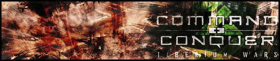
Final Entry

</center>
Posted: 25 Jan 2007, 00:33
by S2000_Skyline12
Nice entry but whats the game? a FPS?
Posted: 25 Jan 2007, 00:37
by korge
Mine?
Posted: 25 Jan 2007, 00:49
by S2000_Skyline12
Yeah, Never mind I found it out from Wikipedia, Looks like a cool game

Posted: 25 Jan 2007, 04:23
by Sir Ibi
HOORAH!!! More scanlines please!!!
Is there any hope left on this dying earth

Posted: 25 Jan 2007, 05:01
by xHaZxMaTx
I blame Jop.
Posted: 25 Jan 2007, 05:30
by Sir Ibi
Gonna enter a hitman sig for this comp, got two slight variations not sure which to go with tbh


Posted: 25 Jan 2007, 06:10
by S2000_Skyline12
I'd go with the 2nd one. Gives him the "cold killer look" that he already has in picture

Posted: 25 Jan 2007, 21:50
by Sir Ibi
Well I've gone with the first one with a little more saturation to add that cold feel to our beloved friend
Rear Entrance

Posted: 27 Jan 2007, 02:05
by The Gravedigger
Frontal Assault

Omfg.... a sig from me lately that isn't blue!
Posted: 27 Jan 2007, 02:47
by Sir Ibi
He SHOOTS! and he scores!
Awsome sig!
Posted: 27 Jan 2007, 03:58
by S2000_Skyline12
Kickbum sig

Posted: 27 Jan 2007, 05:32
by boganbusman
Good to see you changed the colour . . . it hides the aliasing better :>
Posted: 27 Jan 2007, 06:56
by The Gravedigger
Aliasing was through the sharpening.... was intentional to bring the gun and other parts out a bit more also, just didn't want it all over (some parts just looked plain crap :<) so blurred the shoulder a tad.
Posted: 27 Jan 2007, 16:47
by korge
Jeez GD. How on earth do you get all these crazy looking effects that just look good. O.O
Posted: 27 Jan 2007, 20:46
by xHaZxMaTx
Brushes, filters and renders.

Posted: 27 Jan 2007, 22:11
by S2000_Skyline12
So whens this thing start?