!~~Show off your sig~~!



-
Porsche-AG

- Unbeatable

- Posts: 2581
- Joined: 22 Jun 2006, 03:12
- Location: Canada
Re: !~~Show off your sig~~!
Him and his fur-fetish terms.xHaZxMaTx wrote:Vixen.

Just kidding.
@ Jopuma: The avatar's 1337 dance moves coincided with the beat of the song I was listening to when I saw it


-
S2000_Skyline12

- Unbeatable
- Posts: 3538
- Joined: 05 Jan 2005, 23:59
- Location: Long Island, New York Birthday:12.23.92
Re: !~~Show off your sig~~!
Ahhh XD, that'll never get old hahaPorsche-AG wrote:Him and his fur-fetish terms.xHaZxMaTx wrote:Vixen.
Yeah, better set, I remember it

*sig removed for being too big. max size 550x120px & 50kb*


-
powerof1000

- Drift King

- Posts: 521
- Joined: 22 Mar 2007, 09:21
- Location: New Z Land
Re: !~~Show off your sig~~!
I made a new sig, now I just need an avatar to match 
EDIT: All done now
EDIT: All done now
www.soundcloud.com/spyre
Re: !~~Show off your sig~~!
HA, no.xHaZxMaTx wrote:Did you take those photos yourself?
 Ah, I guess I shoulda put a disclaimer in my post. Just a really cool photo compilation I came across.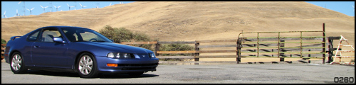
-
Porsche-AG
- Unbeatable
- Posts: 2581
- Joined: 22 Jun 2006, 03:12
- Location: Canada
Re: !~~Show off your sig~~!
Wow, that's a pretty good looking sig you got there Zero260.
Definitely unique, too
Definitely unique, too

Re: !~~Show off your sig~~!
Methinks I got me a new set. If you didn't notice I've returned to my grunge roots


Re: !~~Show off your sig~~!
Should I use?

I already know HaZ is going to HATE it because it's made entirely with brushes. Except for the car and text.
I already know HaZ is going to HATE it because it's made entirely with brushes. Except for the car and text.
Re: !~~Show off your sig~~!
I don't dislike your sigs because they use brushes, I just don't think they're as creative as they could be.  Besides, anything would be better than your current sig.
Besides, anything would be better than your current sig. 
Re: !~~Show off your sig~~!
xHaZxMaTx wrote:I don't dislike your sigs because they use brushes, I just don't think they're as creative as they could be.
So THAT'S your reasoning.
And yes I would agree that anything would be better than this....... thing I have as a sig.
I guess I lost my "grunge" touch.

I'll just change the font on that sig and then switch to it.
-
S2000_Skyline12
- Unbeatable
- Posts: 3538
- Joined: 05 Jan 2005, 23:59
- Location: Long Island, New York Birthday:12.23.92
Re: !~~Show off your sig~~!
Man...I'm not gonna lie Jop, it's not your best work
*sig removed for being too big. max size 550x120px & 50kb*
Re: !~~Show off your sig~~!
I know. It's hard to make graphics on my laptop because the colors are all freaky. My laptop showed it as looking pretty decent but when I opened it up on my desktop computer I found the colors to be too bright and annoying for it to be a Prostreet sig. So I remade it (on my desktop computer for better results) with better colors and a different car and font.S2000_Skyline12 wrote:Man...I'm not gonna lie Jop, it's not your best work
Looks much better than the BMW one IMO.

Re: !~~Show off your sig~~!
I actually prefer the BMW sig. It's got a more uniform style; looks like you put more thought into it and paid more attention to details.
Re: !~~Show off your sig~~!
I like the second better, but the car seems to throw it off. You have all this hectic craziness behind this really clean, stock Superleggara. Doesn't seem right. Maybe a highly modified import with crazy graphics would fit better.

Re: !~~Show off your sig~~!
Trippy. Anywho, if you bothered to make it actually cell-shaded without the use of gradients, I think it would look a lot better as it would look more cartoon-ish and somewhat match the style of the background.
Something like this (didn't bother to do the wheels):

Something like this (didn't bother to do the wheels):
-
Porsche-AG
- Unbeatable
- Posts: 2581
- Joined: 22 Jun 2006, 03:12
- Location: Canada
Re: !~~Show off your sig~~!
I agree with HaZ. And if you made the majority of the sig transparent, it would probably turn out pretty nice (if you used the one that HaZ posted).