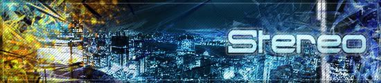
Rate the signature above you!

Everything that has to do with art goes into this board. Post your creations and hear what other people have to say about it!
User avatar
BrontoX
Professional
Professional
Posts: 1895
Joined: 25 Oct 2006, 12:42
Location: Bucharest, Romania

Post by BrontoX »

New sig i see:
Creativity: 7
Appearance: 9
Difficulty: 9 (i think it's difficult cuz i don't know how to do it)

Overall: 8.3
Image
korge
Unbeatable
Unbeatable
Posts: 5932
Joined: 09 Apr 2004, 20:37
Location: nfsunlimited.net

Post by korge »

Creativity: 5
Appearance: 7
Difficulty: 4

Simple but it looks good.
korge
DeMyX
Turbo Charged
Turbo Charged
Posts: 212
Joined: 02 Nov 2006, 21:50
Location: Oslo, Norway

Post by DeMyX »

korge wrote:Creativity: 5
Appearance: 7
Difficulty: 4

Simple but it looks good.
Did you even read the rules? Only once per page.

Next person rate BrontoX
Image
User avatar
BKize_GT
Drift King
Drift King
Posts: 920
Joined: 30 Jul 2005, 18:49
Location: Behind The Wheel

Post by BKize_GT »

Creativity: 5
Appearance: 4
Difficulty: 2

Overall: 3.7

Bit too simplistic for my tastes :wink:
User avatar
weedman173
Professional
Professional
Posts: 1605
Joined: 25 Feb 2005, 01:27
Contact:

Post by weedman173 »

Creativity: 7
Appearance: 8- Great brushing technique
Difficulty: 6-I have tried to make one of these kind of sigs and it looked crappy, good job


Overall: 7

I like abstract art like this.
Image
User avatar
t3ice
Professional
Professional
Posts: 1769
Joined: 26 Jun 2006, 18:48
Location: LaZy Town, Ohio

Post by t3ice »

@ Weedman's sig

Creativity: 8
Appearance: 6 ( maybe cuz ive seen it for too long :| )
Difficulty: 8 ( if u've made ur avatar from the sig..then i can imagine ur skills :shock:
)


Overall: 7.34

Tough to make but dosent quite do the trick ;)
_________________________________________________________________

Right...well my sig is like almost 5+ months old...AND i made it when i had no clue of photoshop....

I now realize i need a change ...but unfortunately i dont have much time these days :P
Image
korge
Unbeatable
Unbeatable
Posts: 5932
Joined: 09 Apr 2004, 20:37
Location: nfsunlimited.net

Post by korge »

Im a person who care less for the rules but sure. Youre the boss.
t3ice wrote:@ Weedman's sig

Creativity: 8
Appearance: 6 ( maybe cuz ive seen it for too long :| )
Difficulty: 8 ( if u've made ur avatar from the sig..then i can imagine ur skills :shock:
)


Overall: 7.34

Tough to make but dosent quite do the trick ;)
_________________________________________________________________

Right...well my sig is like almost 5+ months old...AND i made it when i had no clue of photoshop....

I now realize i need a change ...but unfortunately i dont have much time these days :P
I dont know if anyone has ever heard of Adobe Audition???

Image

:roll:

This thread lacks the background knowledge of people who actually know skill when they see it so they rate difficulty incorrectly. My sig is a rescale of a poster I made for a Support our troops program and looks spectacular but others may disagree. I think my sig looks sucks but m original print looks great.

Btw, there is nothing awesome about rendering a backing, slapping a cut and paste character on it, then adding a few bloom affects. Gaming sites are littered with them.
korge
User avatar
underoath285
Drift King
Drift King
Posts: 266
Joined: 26 Aug 2005, 03:36
Location: Cleveland, OH

Post by underoath285 »

wow i always thought weedman made that;

that changes everything....

as for korge...

Creativity - 5 (basic design)
Appearance - 8 (i like how it looks)
Difficulty - 6 (doesnt seem too hard)
Image
User avatar
Stereo
Unbeatable
Unbeatable
Posts: 3942
Joined: 18 Aug 2003, 19:33
Location: Outside your window

Post by Stereo »

Creativity - 7
Appearance - 6 (Needs a little work IMO... make the box some other color, not brown. >_<)
Difficulty - 7

Meh, mine probably sucks.
Image
User avatar
prince1142003
Valued Member
Valued Member
Posts: 3862
Joined: 23 Feb 2005, 06:03
Location: Enjoying college life.
Contact:

Post by prince1142003 »

Creativity - 6 (somewhat unique)
Appearance - 7 (could be better)
Difficulty - 9 (unless that background was stolen from another image)
Image
User avatar
Stereo
Unbeatable
Unbeatable
Posts: 3942
Joined: 18 Aug 2003, 19:33
Location: Outside your window

Post by Stereo »

The background was made up of loads of layers >_<. Manipulation x10000.
(It wasn't stolen)

prince's sig:

Creativity - 7 (Pretty cool layout but rather simple background)
Appearance - 8 (Like the cars :D)
Difficulty - 5 (Cut and paste, shadows, text..)
Image
User avatar
prince1142003
Valued Member
Valued Member
Posts: 3862
Joined: 23 Feb 2005, 06:03
Location: Enjoying college life.
Contact:

Post by prince1142003 »

Simple background to accentuate the cars =D

The shadows were hand brushed. Took a while.
Image
User avatar
Stereo
Unbeatable
Unbeatable
Posts: 3942
Joined: 18 Aug 2003, 19:33
Location: Outside your window

Post by Stereo »

Hmm. It's an impressive job if it was handbrushed. I thought it was feathered. :P
Image
User avatar
prince1142003
Valued Member
Valued Member
Posts: 3862
Joined: 23 Feb 2005, 06:03
Location: Enjoying college life.
Contact:

Post by prince1142003 »

Feathering did constitute a part of it. I guess the size decrease from 1280x960 reduced quality a bit. I find that realistic shadows cannot be made by feathering alone.

Anyways, no more off topic please or else we might get banned, :lol:.
Image
User avatar
xHaZxMaTx
Unbeatable
Unbeatable
Posts: 8940
Joined: 26 Jun 2005, 05:32
Location: Cali-for-ni-a

Post by xHaZxMaTx »

People seem to be taking the 'Once per page' rule and beating it with a stick. :| I believe the last person who was supposed to recieve critique was t3ice.
Image
User avatar
SliM_880
Professional
Professional
Posts: 1616
Joined: 05 May 2005, 08:44
Location: Abu Dhabi, UAE
Contact:

Post by SliM_880 »

i think we should be able to comment twice per page... once is too little...

T3ice's sig:

Creativity - 8
Appearance - 6
Difficulty - 5

Overall: 6.33
Image
User avatar
race_invader
Professional
Professional
Posts: 2046
Joined: 22 Jul 2006, 15:58
Location: WA, Perth

Post by race_invader »

SliM_880

Creativity - 9

Appearance - 7

Difficulty - 10 <<< For me anyway :wink:

lol thats a sexy sig i must say :lol:
Image
User avatar
xALFAxGT
Drift King
Drift King
Posts: 274
Joined: 25 Oct 2006, 12:28
Location: Baile Atha Cliath

Post by xALFAxGT »

Race Invader

Creatvity - 4
Appearance - 5 (Sig slightly too small)
Difficulty - 4

Overall: 4.3333

Not a big fan of that sig - sorry man!
Image
DeMyX
Turbo Charged
Turbo Charged
Posts: 212
Joined: 02 Nov 2006, 21:50
Location: Oslo, Norway

Post by DeMyX »

Creativity: 1 A bit simple to be called creative in my eyes.

Apperance: 3 A bit too simple for my taste i'm afraid. Only the unique text made it a 3

Difficulty: 2 If it wasn't for the text I would have rated it 1.

Overall: 2
Image
korge
Unbeatable
Unbeatable
Posts: 5932
Joined: 09 Apr 2004, 20:37
Location: nfsunlimited.net

Post by korge »

Being a little tough there...


Creativity: 4 Can be made by anyone who follows a Photoshop signature tutorial.

Apperance: 8 Looks good, dark and evil looking.

Difficulty: 4 Just need to know how to work with layers and effects to get the same result.
korge
User avatar
BrontoX
Professional
Professional
Posts: 1895
Joined: 25 Oct 2006, 12:42
Location: Bucharest, Romania

Post by BrontoX »

Ok now you are allowed twice per page cuz even i was getting annoyed cuz it was long before a new page was made.

Creativity: 2 (i know i put a small rating when mine is even worse but i am not downvoting it's just my opinion)

Apperance: 5 can't see what is in the sig and it's small

Difficulty: 4

Overall: 3.6666 sorry mate
Image
User avatar
Jopuma
Unbeatable
Unbeatable
Posts: 5697
Joined: 21 Feb 2005, 02:06
Location: ...

Post by Jopuma »

Creativity: 2
Appearance: 2
Difficulty: 1

Overall: 1.06

Sorry it's that low, but it's just two pictures put next to eachother on a black background with the cutout words of NFS: Carbon on the top and some standard text with a little bit of blending options.
Image
User avatar
BKize_GT
Drift King
Drift King
Posts: 920
Joined: 30 Jul 2005, 18:49
Location: Behind The Wheel

Post by BKize_GT »

Creativity - 5
Appearance - 8
Difficulty - 4

Overall - 5.7

Nice sig, but a bit simple IMHO
User avatar
Jopuma
Unbeatable
Unbeatable
Posts: 5697
Joined: 21 Feb 2005, 02:06
Location: ...

Post by Jopuma »

Creativity: 3
Appearance: 4
Difficulty: 1

Overall: 2.7 (rounded up from 2.66666667)

It's an ok sig but not that great considering it's just a white background and a red brush set downloaded from DeviantArt (that's where I got that set from anyway).
Image
korge
Unbeatable
Unbeatable
Posts: 5932
Joined: 09 Apr 2004, 20:37
Location: nfsunlimited.net

Post by korge »

Oh shoot. Im sensing some tension between low votes. I feel it myself.

We all like our works of art and when someone tries to be a smart ass and says it doesnt look difficult or detailed, we get mad. I know we all do whether we post it or not...

Cmon people, be more sensisitive. In fact dont even vote on difficulty becuase you Dont know how much Actual work went into it. Keep it to Creativity or Style or Apperance if you can.
korge
Post Reply

Return to “Creativity Board”